At least they have templates !
There have been various attempts to create industry standards for HMI screen layout and functions. There's an outstanding book I haven't bought for myself yet called "High Performance HMI" [
Amazon link].
If you're going to be responsible for improving HMI performance and usability, that book would be a great investment.
I'm re-doing a WinCC HMI right now and I'll give you a handful examples from that project.
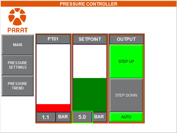
1. Data entry fields should have a white background. Look on this page... the Title and Text fields invite you to click inside them and start typing. Similar display-only fields should have a light gray background.
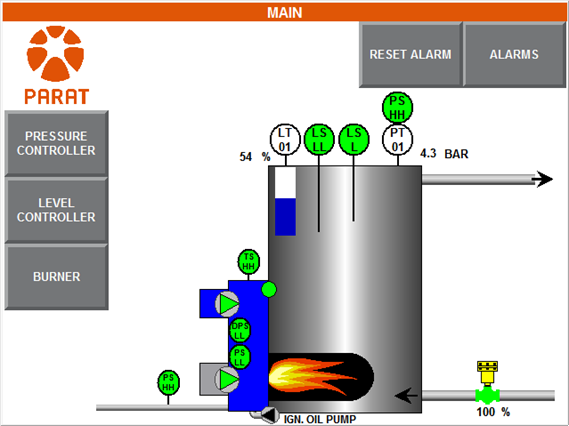
2. I think that actual "looks like an 800T" pushbuttons are a waste of screen space, but it's worth it to make buttons look different from multi-state indicators. You can use native borders, or my favorite, graphic backgrounds that look like actual keyboard keys.
On the HMI I'm repairing, the original author added "PB" to every label that was a pushbutton because the operators couldn't tell yellow buttons from yellow indicators.
3. Come up with a color code and stick with it. If you're going to use green and red for "Start" and "Stop', use a darker color for the not-active state and a bright color for the active state.
4. Put your rows of menu buttons on the bottom and right edges (at least, in English-speaking countries and where right-handedness is most common).
This one is a little counter-intuitive at first, especially because so many people are accustomed to top-edge tabbed displays on Web browsers and many HMI devices provide a left-edge set of soft keys (like Red Lion).
But once I noticed how often the screen was blocked by my hand while reaching for a navigation button (and while viewing the new screen for the first time), I was a convert to bottom-and-right navigation bars.
On the HMI I am repairing, the navigation buttons are sometimes clustered on the left, sometimes on the upper right, and occasionally in a row along the bottom, depending on which screen is active.
The new gradient shading in FactoryTalk View 7.0 and the inclusion of the Symbol Factory library can help your application look more modern than the old blue-rectangles look of PanelBuilder.


")