The esthetics of hmi programming

Goody

Member
Join Date
Apr 2002
Location
Huddersfield W Yorks UK
Posts
1,081
Here is a new angle I would like peoples advice or help with!

Any suggestions to help with my programming or to be more exact my HMI programming would be useful.
Not the actual programming of HMI's (I have been doing them for years) but the layout and sequence and especially the esthetics (aesthetics)

(ěs-thět'ĭk)


adj.
  1. Relating to the philosophy or theories of aesthetics.
  2. Of or concerning the appreciation of beauty or good taste: the aesthetic faculties.
  3. Characterized by a heightened sensitivity to beauty.
  4. Artistic: The play was an aesthetic success.
  5. Informal Conforming to accepted notions of good taste.
When I program an HMI from scratch, I give a lot of thought to the sequential flow of the pages and order of importance. But, to be truthful, I often struggle to make them look 'pretty' or appealing.
I dont mean my buttons or data inputs are too big or all over the place - they are usually rigidly lined up and functional.

Sometimes though, I see someone elses HMI work and I have immediately thought 'ooh this is pleasing to the eye' but I don't know why.
I am a logic thinker - not an artist. (I think it is to do with a dominant left or right brain) I am also dyslexic (as are many men) and I have thought maybe that has something to do with it.

Also, if I am being honest, some of my HMI's seem to baffle the operators. Maybe not baffle but sometimes they struggle to navigate to the right page.
I watch them try navigate, and it seems blindingly obvious to me which button they should press but I watch them hovering over several choices and going the wrong way :)

So any hints or advice from some of you great hmi designers would be appreciated.
 
I feel your pain! I think this is pretty universal for most of us.

The only thing of value I can offer is one I know you already know - get a real operator to work with you to make it more intuitive. This is very time consuming, yes, but usually worth it in the long run.

I hope some good responses come from this.

Steve
 
While ago Control Engineering magazine had article regarding this.

Here it is:

Top 10 Tips for Operator Interface Design
Communicate clearly and configure quickly. Those are the dual goals of human machine interface (HMI) design. Accomplishing those goals depends on the techniques you choose and the tools you use. Here are ten quick tips for making sure your next operator interface project is a success.

1. Color scheme simplicity
Lay elements on a screen with a neutral color like gray. Then highlight items that need attention with a bright, bold color, such as yellow, red, or green. The neutral color minimizes distraction when an operator is doing his normal job, and the bright colors help to draw operator attention to extraordinary circumstances.

2. Information simplicity
Don't crowd the screen with information - place only the information for the current task. Putting more information than is needed on a screen forces operators to search for the one piece of information they need. This could lead to an operator pressing a similar button and making a mistake, or it can increase the time it takes for an operator to figure things out.

3. Consistency
Have a consistent set of menu buttons to help operators navigate easily from screen to screen, and keep them in the same place on each screen. This makes operations simple to understand and eases training.

4. Functional separation
Separate operator screens from maintenance and supervisor screens. When you consider who is using the device most of the day, you can tailor the screens for that user and help him be as efficient as possible. In relation to Tip #2, Information Simplicy, this enables you to create a separate set of screens for a particular user, if appropriate.

5. Test your knowledge
Capture how many times a button is pressed, a page is changed, which page is used most, etc.. Reviewing this data may surprise you. You might find that a piece of information not on the main page is more important than you thought after you review how many times someone goes to a different page to retrieve it. Such a review allows you to fine tune your application and help operators spend less time navigating from screen to screen.

6. Multilanguage considerations
Today's diverse working environment requires the use of multi-language support in operator interface products. If there's a chance your application will require translation, keep in mind that some languages might often take up a larger text area than the English equivalent. You should, therefore, make text areas large enough to accommodate various languages.

7. Watch your MLAs
Multi-letter acronyms and other abbreviations only work when all users understand their meaning, so spell out acronyms whenever possible. If you don't have enough room to place the actual phrase that would make sense, note that your screen might be too crowded or too small.

8. Use images
Most people use their vision more than any other sense, making pictures and illustrations a great way to quickly draw a user's attention. In a pump application, for example, you can use an illustration of the pump itself and highlight specific areas that need maintenance or adjustment.

9. Group data together
Just like placing a pump image on the screen to draw attention, you should place any elements associated with the pump close to the image. This could include the start and stop buttons and readouts for current, temperature, volts, hours run, etc. Placing this information elsewhere on the screen can lead to confusion and limit operator productivity.

10. Plan for change
Dare to assume that the application will eventually be used on a different size display. For whatever the reason—customer request, panel got smaller, panel got bigger, need color, don't want color, etc.—sometime there may be a need to use a different display. Prepare by keeping elements on the screen at a high contrast to the background. For example, use a black background and light-colored elements (like light gray) in your base design. This will be very visible on both color and gray-scale displays.
 
I keep the flow-sheet part of my HMI's very simple and classical.
There is a lot of information, colors change, arrows display on/off, silos are filled, all according to the status of the plant components. But it is all minimalistic and simple.

I dont like 3D views unless it is required. Same for shadows, extra unnecessary visualisatione etc.

To the previous post:
8. Use images
Most people use their vision more than any other sense, making pictures and illustrations a great way to quickly draw a user's attention. In a pump application, for example, you can use an illustration of the pump itself and highlight specific areas that need maintenance or adjustment.
I do not use images at all ! I use basic symbols, or very simplified schematics. An image such as the mentioned "pump illustration" draws the attention to the pump. Exactly, and I do not want to draw the attention unless it is necessary. The HMI's I have seen made by others who plaster the sceens with imported images are all god-awful.

One thing that has not been mentioned, is that a master-view where you can see the entire plant or machine in one picture is really nice. Some fine details may not be shown, but the "big picture" is. Showing a complete plant in one view requires the simplicity that I mentioned above.
I have seen other HMIs where you have to scroll through way too many screens, and the operators make many mistakes because they dont have a good sense of the overall status of the plant.
 
I always avoid any add-on packages. I have found these to be troublesome in any upgrade path.

I agree is Jesper ... keep it simple. Use consistency in coloring. Make graphics "animate" only when they need attention.
I keep the processes unique colors and are consistent on the entire system.
Alarms have a specific color scheme ... and they don't use process colors.

For alarming, I have boxes in my header window ... one for all alarms, a larger one for alarms associated with that screen, and one for critical alarms.
 
I am in the same situation as Goody.

Goody: is it possible you can post some images of your screens and point out your issues.

I am just starting out with WinCC flex on a TP177A. I just end up with pages of screens with buttons! Booooring.

.
 
I'm obviously at odds with customer opinion on this, as we've spent a lot of time adding features to C3 to support some of the things I detest in HMI design. For example, I hate flashing. IMHO it should be used only for alarms, and even then, only the background should flash, and the text should be there all the time. I also hate mimics that show the run-stop state of something by animating it. I want to be able to look at the screen and see the status in an instant; I should not have to wait to see if it's moving! And let's not even get into magenta...
 
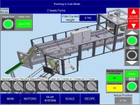
I've always used graphics as it is a lot easier than switching language for the operator.
Graphics are universal.
A lot less work to do the text on the remaining buttons and dispay messages and such.
If you touch the elctrical enclosure, you get to the actual PLC, Modules, etc.
Same with the filler, the carton magazine, etc.

Main_Screen.jpg
 
Last edited:

Similar Topics

Good Day to all of you, this is my first post, i will try to explain as best as possible, english is not my natural language. I am performing an...
Replies
0
Views
28
Does anyone happen to know how to install the graphic picture in HMI when I go into blower selection there are no graphics shown not only blower...
Replies
1
Views
63
Does anyone happen to know how to install the graphic picture in HMI when I go into blower selection there are no graphics show not only blower...
Replies
1
Views
97
Hello All, I've been tasked with automating a flatbed press that runs with some pretty extreme temperatures. I've been told it can run close to...
Replies
4
Views
162
Good morning! Let me start by saying, I am still learning about this type of HMI programming. I recently watched a video about recipes and how it...
Replies
0
Views
68
Back
Top Bottom